
There’s a particular kind of magic in watching a whole city move at once. Not one bus, not one train — all of them, gliding across the map in real time, each one a little rectangle of somebody’s commute home.
That’s Dashing Arrivals — a live transit map for the Puget Sound region. Open it up and you’re looking at every active bus, train, and ferry in service right now, from a King County Metro coach on Rainier Avenue to a Sound Transit Link train sliding through the Rainier Valley to a Washington State Ferry crossing to Bainbridge. On a typical weekday afternoon that’s over 1,100 vehicles on screen, all updating live.
This post is a tour of what it is and what you can do with it.
The whole region at a glance
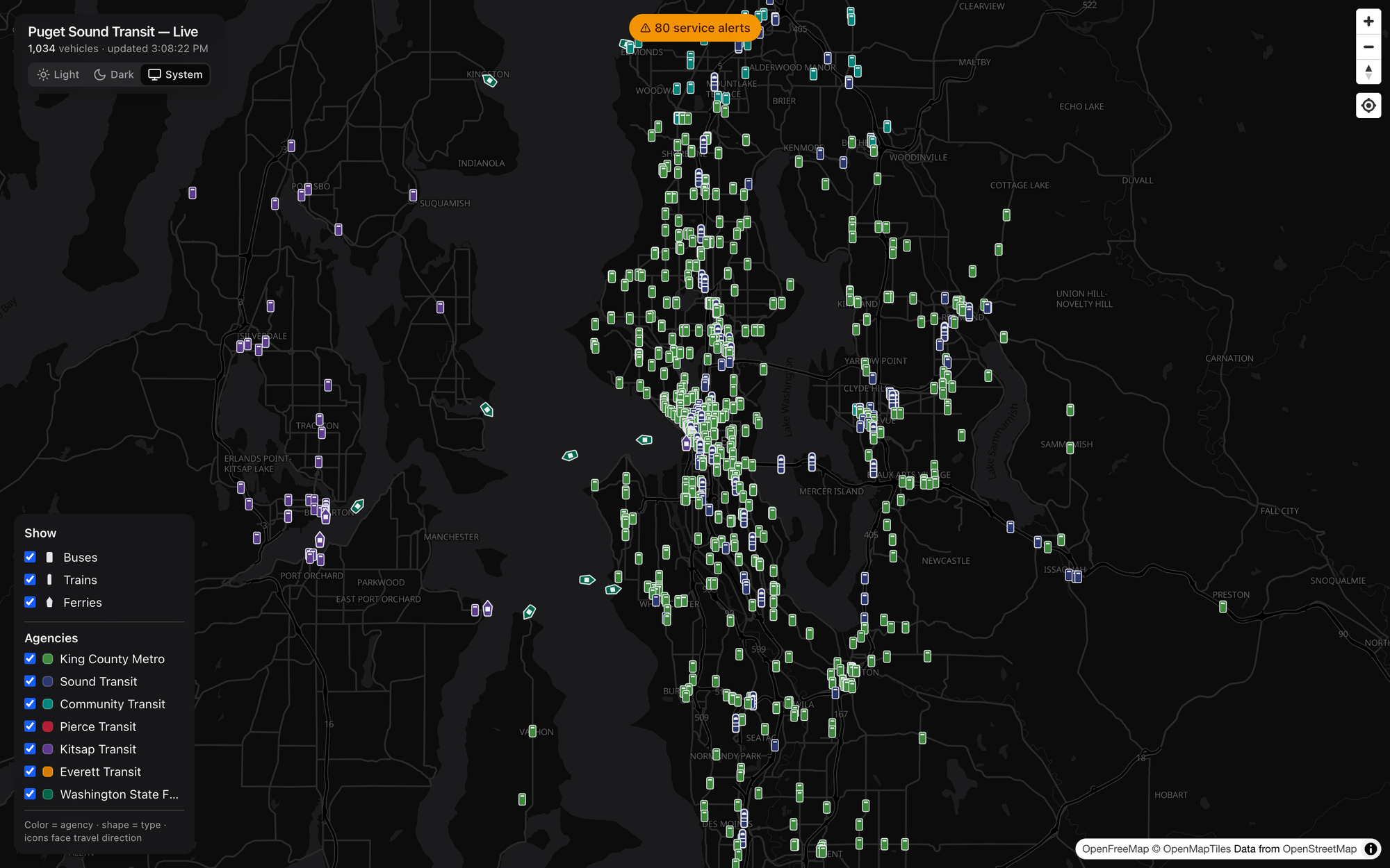
The default view drops you over Puget Sound with everything turned on. A quick legend does a lot of work here: color tells you the agency and shape tells you the type (bus, train, or ferry), and every icon is rotated to face the direction it’s actually traveling. Green is King County Metro, blue/indigo is Sound Transit, red is Pierce Transit, purple is Kitsap, and so on — seven agencies in all, plus the ferries.
Pan, zoom, and the icons resize smoothly so trains read a little larger than buses, which read a little larger than ferries. Between updates, vehicles don’t teleport — they animate from their last position to the next one, so the whole map has a calm, continuous, living quality instead of a jumpy refresh.
Click any vehicle for the details
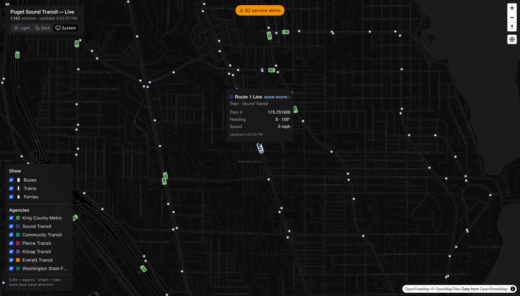
Tap a vehicle and it tells you who it is: the route, the agency, the fleet number, its heading (as a compass direction and degrees), its speed, and when it last reported in. Here’s a 1 Line Link train in the Rainier Valley, heading south at 159°.
See that Show route ▸ link at the top of the popup? That’s where it gets fun.
See the entire route
Click Show route and the map draws the vehicle’s full line — the shape it follows and every stop along the way — right under the live vehicles still moving on it.

Here’s the 1 Line, Link light rail’s spine, threading from the north down through downtown, Beacon Hill, and the Rainier Valley. The blue train icons strung along the highlighted line are the actual trains in service on it right now.
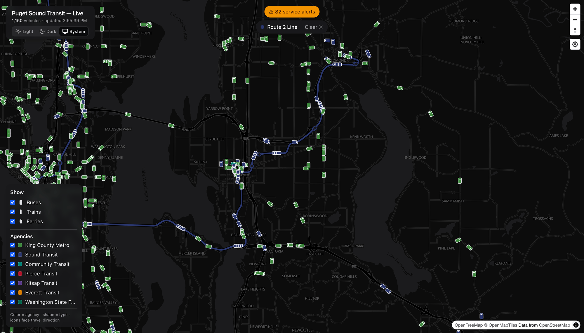
And the newer 2 Line, running across Lake Washington on I‑90 to Bellevue and up to Downtown Redmond. (Fun bit of local history: the 2 Line effectively replaced the old ST Express 550 bus between Seattle and Bellevue — which is why you won’t find a 550 on the map anymore.)
Rail beyond Link: the Sounder
Light rail isn’t the only train out there. Pick a Sounder commuter-rail train and you get the full BNSF corridor.

This is the S Line, running from King Street Station in Seattle south through Tukwila, Kent, Auburn, and on toward Tacoma and Lakewood. Sounder only runs during peak commute windows, so catching one on the map is a small, satisfying reward for looking at the right time — and down in Tacoma you can see Pierce Transit’s red buses fill in the local network.
Buses, of course — every route
The same trick works for any bus. Click one, hit Show route, and the corridor lights up in that agency’s color.
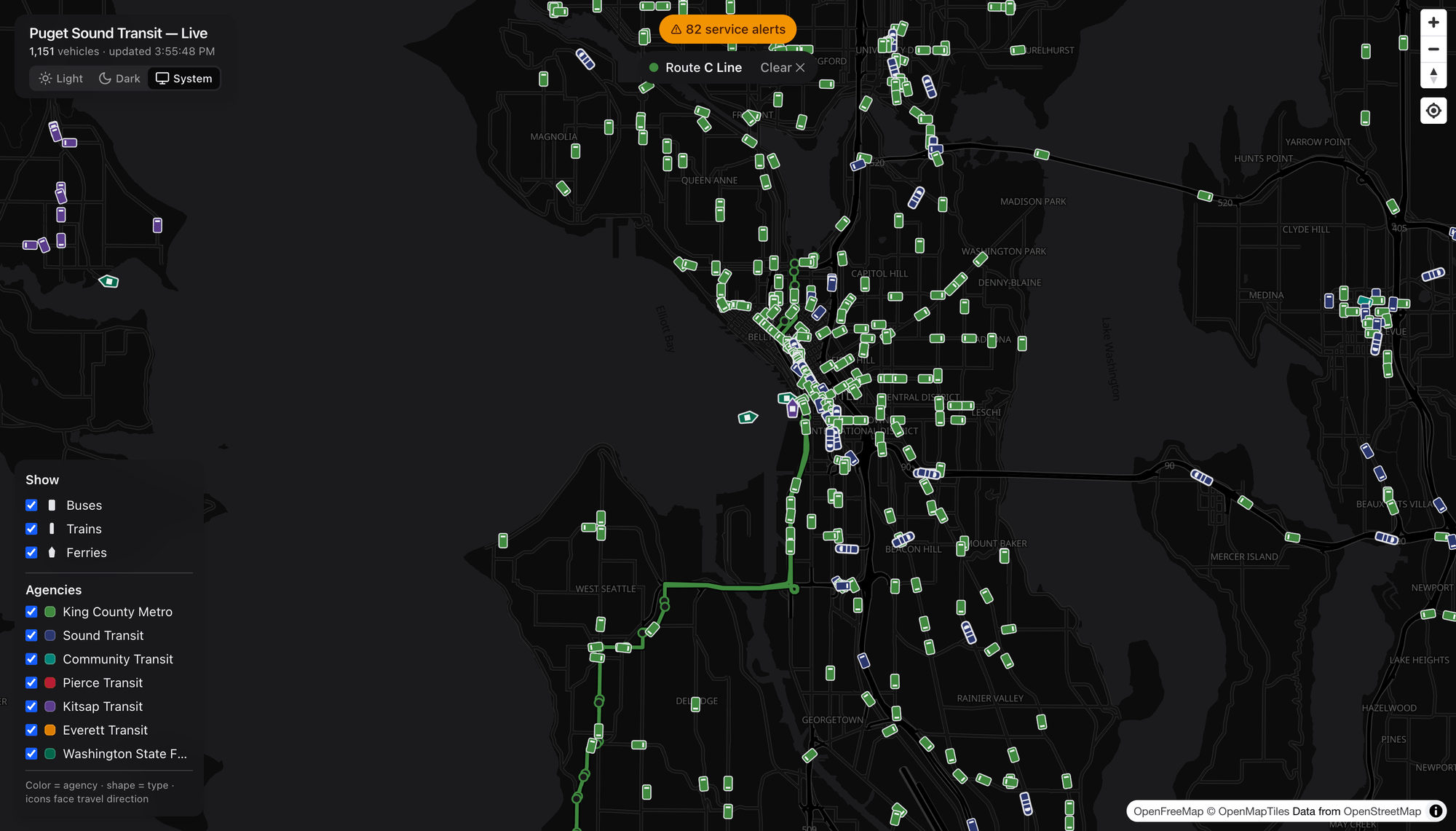
The RapidRide C Line from West Seattle into downtown, in Metro green.
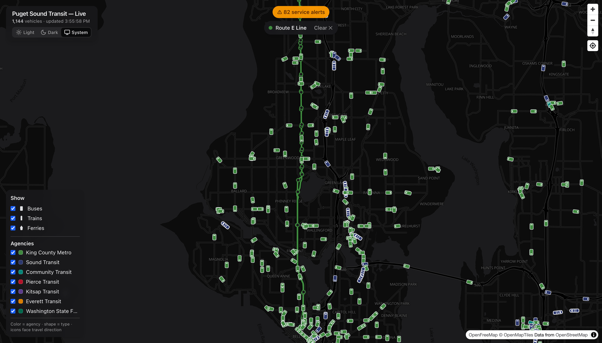
And the RapidRide E Line, a ruler-straight shot down Aurora Avenue from Shoreline to downtown — one of the busiest bus corridors in the state. Whether it’s a lettered RapidRide line, a numbered local route, or a Community Transit Swift line, the route overlay works the same way.
Filter the firehose
Eleven-hundred vehicles is a lot. The Show and Agencies panel lets you dial it in — toggle whole modes or individual agencies on and off.
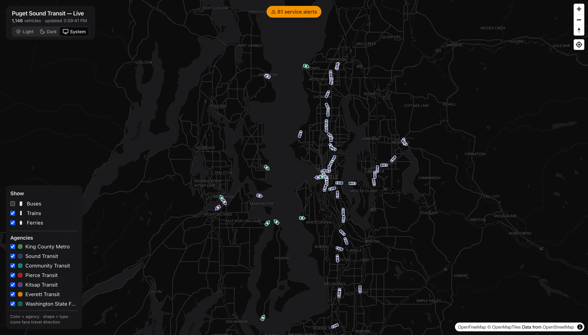
Here I’ve switched off buses to leave just trains and ferries. Suddenly the shape of the rail network jumps out — the Link lines tracing north–south and across the lake — alongside the ferries stitching the Sound together to Bainbridge, Bremerton, Kingston, and Vashon. It’s the whole regional rail-and-water map, drawn entirely by the vehicles themselves.
When’s my ride? Live arrivals at any stop
Zoom in and the stops appear. Click one to get a live arrivals board.
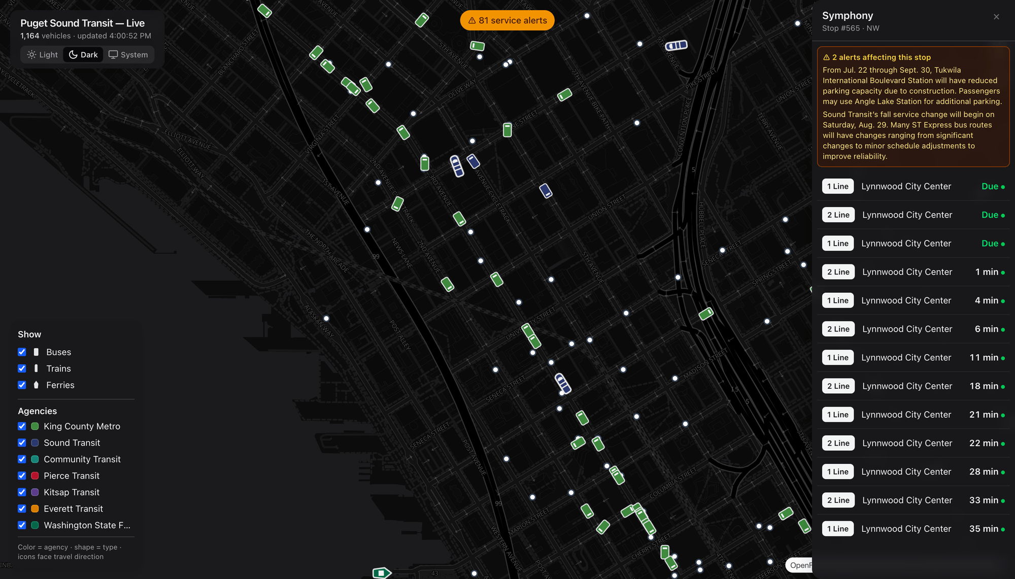
This is the Symphony stop downtown, with real-time predictions counting down — Due, Due, 1 min, 4 min, 6 min… — for 1 Line and 2 Line trains toward Lynnwood City Center. Each prediction carries a live indicator, and any alerts that affect this specific stop are pinned right at the top.
Know before you go: service alerts
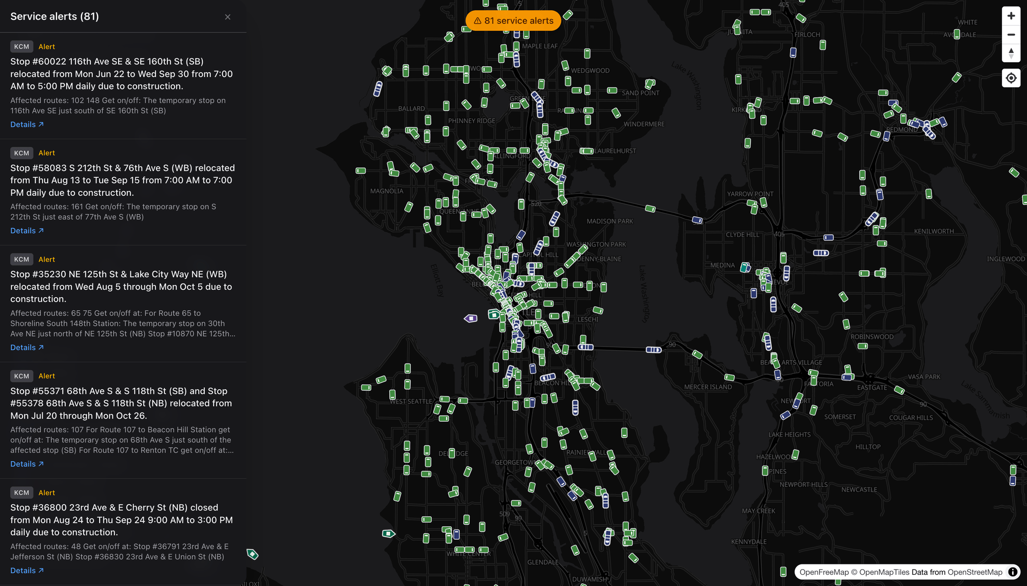
The pill at the top of the screen keeps a running count of active service alerts across the region — detours, stop relocations, reduced service, construction. Open it and you can read them all: each card shows the agency, the affected routes, the reroute instructions, and a link out to the agency’s own detail page. It’s the regional “what’s disrupted right now” board in one place.
Light or dark, your call
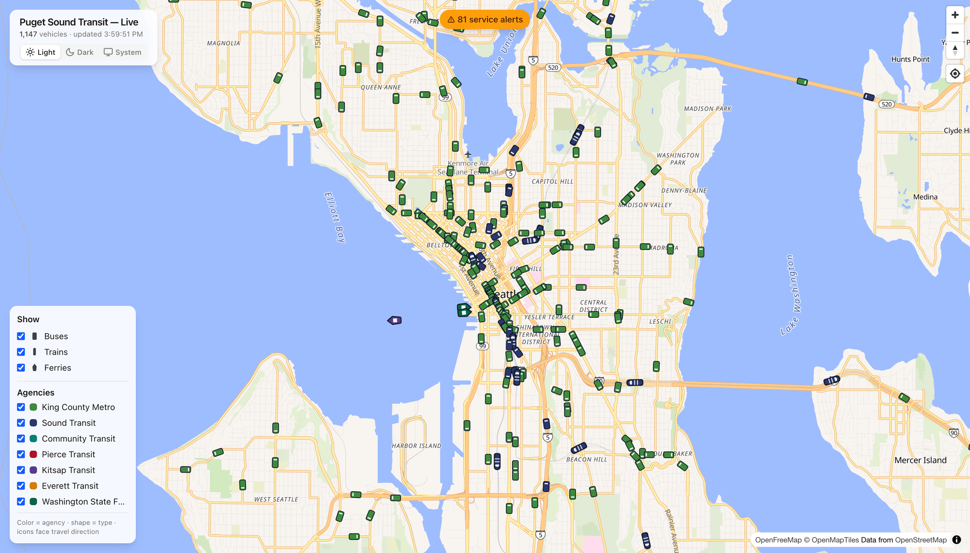
Prefer a bright map? A theme toggle switches between a sleek dark basemap and a clean light one (with a System option that follows your OS). Same live data, different mood.
Under the hood
For the curious, Dashing Arrivals is a modern, open-source web app:
- Live data comes from the OneBusAway Puget Sound regional API, decoded from GTFS‑realtime vehicle-position feeds. A single regional feed covers King County Metro, Sound Transit, Community Transit, Pierce Transit, Kitsap Transit, and Everett Transit.
- Ferries come from a separate source — the WSDOT Washington State Ferries vessel-location API — and are normalized in alongside everything else.
- The map is MapLibre GL on an open OpenFreeMap basemap (no proprietary map key required), with the app built on Next.js and React and deployed on Vercel.
- Vehicle positions are fetched on a short polling loop and cached server-side, then eased between updates on the client so motion looks smooth. Icons are tinted per agency, sized by zoom, and rotated to the reported heading.
Eventually the GTFS feed is going to have some changes, and I plan to put those fixes in then, but in the meantime this is a solid way to explore the Seattle and Puget Sound area’s transit options!
Go watch the city move
That’s the whole pitch: one map, every vehicle, in real time, with routes, stops, arrivals, and alerts a click away. It’s genuinely useful for catching a bus — and, if you’re the type who likes watching systems work, it’s a little bit hypnotic.
Try it for yourself at dashingarrivals.com.
Screenshots captured live from dashingarrivals.com. Basemap © OpenFreeMap / OpenMapTiles, data © OpenStreetMap contributors. Real-time transit data via OneBusAway and WSDOT.
 The
The  are oodles of ideas primed and ready. New SDKs will be coming from the OSS Community for Geoloqi (prospectively including .NET Libs, C++, and even Python!) Needless to say, a LOT of good stuff happened this weekend.
You must be logged in to post a comment.