There is a version of a feature toggle that looks wonderfully simple in a pull request:
if (features.newThing) { doNewThing();}
Then newThing turns out to be a data pipeline, a shipping promise, or a screen people have already started using. Now the switch has an owner, a scope, a failure mode, and a date when we ought to remove it. The if statement is the least interesting part.
I want to work through three concrete examples. The first moves a flat-file order feed through Databricks, then cuts a tenant over to normalized PostgreSQL behind a data API. The second turns on expedited shipping, with the same decision implemented in TypeScript and Go. The third releases a saved-filters interface in React and SwiftUI. Each is a different kind of switch, and each can surprise you if you treat it as a Boolean sprinkled through the codebase.
The examples are deliberately small enough to read, but the boundaries are real: immutable inputs, idempotency, tenant scoping, stable rollout decisions, and the difference between hiding a button and actually controlling a capability. Let’s get into it.
1. The order feed: Databricks today, PostgreSQL data API tomorrow
Imagine a partner dropping one immutable CSV file per batch into object storage. Each row is an item on an order:
order_id,customer_id,customer_name,sku,quantity,event_ato-100,c-7,Ada,rail-pass,2,2026-09-24T10:00:00Zo-100,c-7,Ada,seat-upgrade,1,2026-09-24T10:00:00Zo-101,c-8,Grace,rail-pass,1,2026-09-24T10:01:00Z
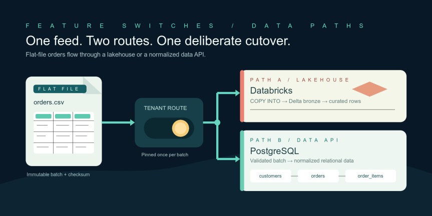
The existing path loads the file into a Databricks Delta bronze table, then produces a current-order table for queries. The proposed path reads that same object, validates it, and sends a complete batch to a private data API. The API writes three normalized PostgreSQL tables: customers, orders, and order_items.
immutable CSV in object storage | batch worker | tenant route snapshot / \ Databricks PostgreSQL data API COPY INTO validate + transaction bronze/curated customers/orders/items \ / read adapter for the tenant
The switch is a tenant route, not a random choice made separately for each row. For a given batch, resolve the route once and put it in the batch log. Changing the route while a file is half processed would create an impressively confusing incident.
The route and the file contract
I keep the control-plane data separate from the pipeline code. In this example the configuration is a checked, versioned snapshot supplied to the worker; in production it might come from a flag service. The important bit is that the worker receives one decision and uses it for the whole operation.
// pipeline/route.tsexport type PipelinePath = "databricks" | "postgres";export interface RouteSnapshot { version: number; defaultPath: PipelinePath; tenants: Record<string, PipelinePath>;}export interface BatchRef { tenantId: string; batchId: string; fileName: string; // a basename under the tenant's immutable S3 prefix sha256: string; // digest of the file's bytes, recorded when uploaded}export function choosePath( config: RouteSnapshot, tenantId: string,): { path: PipelinePath; configVersion: number } { return { path: config.tenants[tenantId] ?? config.defaultPath, configVersion: config.version, };}export function checkBatchRef(batch: BatchRef): void { if (!/^[a-z0-9-]{1,64}$/.test(batch.tenantId) || !/^[a-zA-Z0-9-]{1,100}$/.test(batch.batchId) || !/^[a-zA-Z0-9-]+\.csv$/.test(batch.fileName) || !/^[a-f0-9]{64}$/.test(batch.sha256)) { throw new Error("Invalid batch reference"); }}
The file key is a basename by design. The worker constructs the object path from a fixed bucket and tenant prefix. That keeps a caller from turning a batch submission into “please read whatever URL I hand you.” The SHA-256 is about replay identity: batch-42 with new bytes is an error, not a cute way to overwrite history.
The existing Databricks path
Here is the setup on the lakehouse side. The external location and warehouse already have access to the bucket. I’m showing Databricks SQL because COPY INTO is a good fit for an incremental feed of files, and the loaded-file tracking makes retries tractable. If your feed is millions of files, Databricks points you toward Auto Loader instead.
CREATE TABLE IF NOT EXISTS main.orders.order_rows_bronze ( order_id STRING, customer_id STRING, customer_name STRING, sku STRING, quantity STRING, event_at STRING) USING DELTA;CREATE TABLE IF NOT EXISTS main.orders.order_rows_current ( order_id STRING, customer_id STRING, customer_name STRING, sku STRING, quantity INT, event_at TIMESTAMP) USING DELTA;
The TypeScript adapter submits a SQL statement to a warehouse and waits for completion. For this example every query returns either no rows or a small lookup result; large query results need the API’s external-links disposition and a separate paging design.
// pipeline/databricks.tstype StatementResult = { statement_id?: string; status: { state: string; error?: { message: string } }; result?: { data_array?: string[][] };};export class DatabricksSql { constructor( private readonly host: string, private readonly token: string, private readonly warehouseId: string, ) {} private async request(path: string, init?: RequestInit): Promise<StatementResult> { const response = await fetch(`${this.host}${path}`, { ...init, headers: { Authorization: `Bearer ${this.token}`, "Content-Type": "application/json", ...init?.headers, }, }); if (!response.ok) throw new Error(`Databricks HTTP ${response.status}`); return response.json() as Promise<StatementResult>; } async execute(statement: string, parameters: { name: string; value: string }[] = []) { let result = await this.request("/api/2.0/sql/statements", { method: "POST", body: JSON.stringify({ warehouse_id: this.warehouseId, statement, parameters, wait_timeout: "10s", disposition: "INLINE", format: "JSON_ARRAY", }), }); const deadline = Date.now() + 120_000; while (result.status.state === "PENDING" || result.status.state === "RUNNING") { if (!result.statement_id || Date.now() > deadline) { throw new Error("Databricks statement exceeded worker deadline"); } await new Promise(resolve => setTimeout(resolve, 1_000)); result = await this.request(`/api/2.0/sql/statements/${result.statement_id}`); } if (result.status.state !== "SUCCEEDED") { throw new Error(result.status.error?.message ?? `Statement ${result.status.state}`); } return result.result?.data_array ?? []; }}export async function loadDatabricksBatch( sql: DatabricksSql, batch: BatchRef,): Promise<void> { checkBatchRef(batch); const prefix = `s3://example-order-feed/${batch.tenantId}/`; // Only the basename is interpolated; checkBatchRef restricts its alphabet. await sql.execute(` COPY INTO main.orders.order_rows_bronze FROM '${prefix}' FILEFORMAT = CSV FILES = ('${batch.fileName}') FORMAT_OPTIONS ('header' = 'true') `); // The source file is a complete order snapshot. Deduplicate source rows // before MERGE: two matching source rows for one target key are ambiguous. await sql.execute(` MERGE INTO main.orders.order_rows_current AS target USING ( SELECT order_id, customer_id, customer_name, sku, CAST(quantity AS INT) AS quantity, CAST(event_at AS TIMESTAMP) AS event_at FROM main.orders.order_rows_bronze QUALIFY ROW_NUMBER() OVER ( PARTITION BY order_id, sku ORDER BY CAST(event_at AS TIMESTAMP) DESC ) = 1 ) AS source ON target.order_id = source.order_id AND target.sku = source.sku WHEN MATCHED AND source.event_at >= target.event_at THEN UPDATE SET customer_id = source.customer_id, customer_name = source.customer_name, quantity = source.quantity, event_at = source.event_at WHEN NOT MATCHED THEN INSERT (order_id, customer_id, customer_name, sku, quantity, event_at) VALUES (source.order_id, source.customer_id, source.customer_name, source.sku, source.quantity, source.event_at) `);}
There is a deliberate simplification here: the merge scans bronze and models upserts, not item deletion. If a later snapshot can remove an item, the source contract needs tombstones or a replace-whole-order operation. No toggle solves an undefined deletion contract. Also, in a real lakehouse I would key these tables by tenant, or put each tenant in its own governed schema; the sample’s order_id must be globally unique for the shown merge.
The PostgreSQL path and its data API
On the new path, the database is an implementation detail of the data API. The worker never gets a PostgreSQL connection string. A private, authenticated service receives a complete batch; the service owns validation, idempotency, and the transaction.
CREATE TABLE customers ( tenant_id text NOT NULL, customer_id text NOT NULL, customer_name text NOT NULL, PRIMARY KEY (tenant_id, customer_id));CREATE TABLE orders ( tenant_id text NOT NULL, order_id text NOT NULL, customer_id text NOT NULL, event_at timestamptz NOT NULL, PRIMARY KEY (tenant_id, order_id), FOREIGN KEY (tenant_id, customer_id) REFERENCES customers (tenant_id, customer_id));CREATE TABLE order_items ( tenant_id text NOT NULL, order_id text NOT NULL, sku text NOT NULL, quantity integer NOT NULL CHECK (quantity > 0), PRIMARY KEY (tenant_id, order_id, sku), FOREIGN KEY (tenant_id, order_id) REFERENCES orders (tenant_id, order_id) ON DELETE CASCADE);CREATE TABLE ingestion_batches ( tenant_id text NOT NULL, batch_id text NOT NULL, sha256 char(64) NOT NULL, committed_at timestamptz NOT NULL DEFAULT now(), PRIMARY KEY (tenant_id, batch_id));
The flat file repeats customer names and order IDs. The relational model stores each customer and order once, then each item under that order. This normalization is useful for operational queries and constraints; it is not a claim that PostgreSQL is automatically the better analytics engine. The switch is about the workload we actually need to serve.
The worker downloads the immutable object and parses it. This uses @aws-sdk/client-s3 and csv-parse/sync. I cap the file at 10,000 rows here so the data API can handle one transaction; larger feeds should use bounded chunks with a manifest and a stronger commit protocol.
// pipeline/postgres-path.tsimport { S3Client, GetObjectCommand } from "@aws-sdk/client-s3";import { parse } from "csv-parse/sync";import { createHash } from "node:crypto";export type OrderRow = { order_id: string; customer_id: string; customer_name: string; sku: string; quantity: number; event_at: string;};const s3 = new S3Client({});export async function loadPostgresBatch( batch: BatchRef, apiBase: string, serviceToken: string,): Promise<void> { checkBatchRef(batch); const key = `${batch.tenantId}/${batch.fileName}`; const object = await s3.send(new GetObjectCommand({ Bucket: "example-order-feed", Key: key, })); if (!object.Body) throw new Error("Empty object body"); const bytes = await object.Body.transformToByteArray(); const digest = createHash("sha256").update(bytes).digest("hex"); if (digest !== batch.sha256) throw new Error("Batch content changed"); const records = parse(Buffer.from(bytes), { columns: true, skip_empty_lines: true, bom: true, }) as Record<string, string>[]; if (records.length === 0 || records.length > 10_000) { throw new Error("Batch size outside accepted range"); } const rows: OrderRow[] = records.map(row => ({ order_id: row.order_id, customer_id: row.customer_id, customer_name: row.customer_name, sku: row.sku, quantity: Number(row.quantity), event_at: row.event_at, })); const response = await fetch(`${apiBase}/v1/batches`, { method: "POST", headers: { Authorization: `Bearer ${serviceToken}`, "Content-Type": "application/json", }, body: JSON.stringify({ ...batch, rows }), }); if (!response.ok) throw new Error(`Data API rejected batch: ${response.status}`);}
The API side is where the transaction belongs. zod checks the wire shape; PostgreSQL constraints still carry the final integrity guarantee. The gateway authenticates the service token and supplies the tenant identity; it must verify that the tenant in the request body matches that identity. I’m leaving gateway wiring out of this excerpt, but I would not expose this route to the public internet as an unauthenticated import endpoint.
// data-api/batches.ts (Fastify + pg + zod)import Fastify from "fastify";import pg from "pg";import { z } from "zod";const pool = new pg.Pool({ connectionString: process.env.DATABASE_URL });const app = Fastify();const rowSchema = z.object({ order_id: z.string().min(1).max(100), customer_id: z.string().min(1).max(100), customer_name: z.string().min(1).max(200), sku: z.string().min(1).max(100), quantity: z.number().int().positive(), event_at: z.string().datetime({ offset: true }),});const batchSchema = z.object({ tenantId: z.string().regex(/^[a-z0-9-]{1,64}$/), batchId: z.string().min(1).max(100), fileName: z.string().endsWith(".csv"), sha256: z.string().regex(/^[a-f0-9]{64}$/), rows: z.array(rowSchema).min(1).max(10_000),});app.post("/v1/batches", async (request, reply) => { const parsed = batchSchema.safeParse(request.body); if (!parsed.success) { return reply.code(400).send({ error: "Invalid batch payload" }); } const input = parsed.data; // Gateway auth must bind this tenantId to the authenticated caller. const byOrder = new Map<string, typeof input.rows>(); for (const row of input.rows) { const group = byOrder.get(row.order_id) ?? []; group.push(row); byOrder.set(row.order_id, group); } for (const rows of byOrder.values()) { const first = rows[0]; const skus = new Set<string>(); for (const row of rows) { if (row.customer_id !== first.customer_id || row.customer_name !== first.customer_name || row.event_at !== first.event_at || skus.has(row.sku)) { return reply.code(400).send({ error: "Inconsistent order snapshot" }); } skus.add(row.sku); } } const client = await pool.connect(); try { await client.query("BEGIN"); const inserted = await client.query( `INSERT INTO ingestion_batches (tenant_id, batch_id, sha256) VALUES ($1, $2, $3) ON CONFLICT DO NOTHING RETURNING batch_id`, [input.tenantId, input.batchId, input.sha256], ); if (inserted.rowCount === 0) { const existing = await client.query( `SELECT sha256 FROM ingestion_batches WHERE tenant_id = $1 AND batch_id = $2`, [input.tenantId, input.batchId], ); await client.query("COMMIT"); if (existing.rows[0]?.sha256 !== input.sha256) { return reply.code(409).send({ error: "Batch ID reused with new bytes" }); } return reply.send({ status: "already-committed" }); } for (const [orderId, rows] of byOrder) { const first = rows[0]; await client.query( `INSERT INTO customers (tenant_id, customer_id, customer_name) VALUES ($1, $2, $3) ON CONFLICT (tenant_id, customer_id) DO UPDATE SET customer_name = EXCLUDED.customer_name`, [input.tenantId, first.customer_id, first.customer_name], ); await client.query( `INSERT INTO orders (tenant_id, order_id, customer_id, event_at) VALUES ($1, $2, $3, $4) ON CONFLICT (tenant_id, order_id) DO UPDATE SET customer_id = EXCLUDED.customer_id, event_at = EXCLUDED.event_at WHERE orders.event_at <= EXCLUDED.event_at`, [input.tenantId, orderId, first.customer_id, first.event_at], ); const current = await client.query( `SELECT event_at FROM orders WHERE tenant_id = $1 AND order_id = $2 FOR UPDATE`, [input.tenantId, orderId], ); if (new Date(current.rows[0].event_at).toISOString() !== new Date(first.event_at).toISOString()) continue; // stale snapshot await client.query( `DELETE FROM order_items WHERE tenant_id = $1 AND order_id = $2`, [input.tenantId, orderId], ); for (const row of rows) { await client.query( `INSERT INTO order_items (tenant_id, order_id, sku, quantity) VALUES ($1, $2, $3, $4)`, [input.tenantId, orderId, row.sku, row.quantity], ); } } await client.query("COMMIT"); return reply.send({ status: "committed", orders: byOrder.size }); } catch (error) { await client.query("ROLLBACK"); throw error; } finally { client.release(); }});
Notice the batch marker is inserted inside the same transaction as the rows. If the transaction fails, the marker disappears too. Retrying the file then does useful work instead of being mistaken for a success. The FOR UPDATE also serializes replacement of one order’s items. For exact ties in event_at, the upstream contract should supply a monotonically increasing revision; timestamps alone cannot tell which different snapshot wins.
The read half of the data API keeps PostgreSQL behind the boundary too:
app.get<{ Params: { orderId: string } }>( "/v1/orders/:orderId", async (request, reply) => { // tenantId comes from authenticated gateway context, never a query param. const tenantId = request.headers["x-verified-tenant-id"] as string; const order = await pool.query( `SELECT o.order_id, o.event_at, c.customer_id, c.customer_name FROM orders o JOIN customers c ON c.tenant_id = o.tenant_id AND c.customer_id = o.customer_id WHERE o.tenant_id = $1 AND o.order_id = $2`, [tenantId, request.params.orderId], ); if (order.rowCount === 0) return reply.code(404).send(); const items = await pool.query( `SELECT sku, quantity FROM order_items WHERE tenant_id = $1 AND order_id = $2 ORDER BY sku`, [tenantId, request.params.orderId], ); return { ...order.rows[0], items: items.rows }; },);
That x-verified-tenant-id header is only safe if a trusted gateway strips any client-supplied copy and injects its own value. In a direct deployment, put authentication and tenant extraction in a Fastify hook instead. The point is to show where tenant ownership is enforced, because “the new API is private” is not an authorization strategy.
The consumer needs the same route decision. Here the Databricks query uses a named parameter and the PostgreSQL side uses the data API. The adapter presents one order shape to its caller. This example assumes the order ID is globally unique in Databricks; if it is only unique per tenant, add tenant_id to the Delta tables and both predicates.
// pipeline/read-order.tsexport type OrderView = { orderId: string; customerId: string; customerName: string; eventAt: string; items: { sku: string; quantity: number }[];};export async function getOrder( config: RouteSnapshot, tenantId: string, orderId: string, deps: { databricks: DatabricksSql; apiBase: string; serviceToken: string },): Promise<OrderView | null> { if (choosePath(config, tenantId).path === "postgres") { const response = await fetch( `${deps.apiBase}/v1/orders/${encodeURIComponent(orderId)}`, { headers: { Authorization: `Bearer ${deps.serviceToken}` } }, ); if (response.status === 404) return null; if (!response.ok) throw new Error(`Data API HTTP ${response.status}`); const row = await response.json() as { order_id: string; customer_id: string; customer_name: string; event_at: string; items: { sku: string; quantity: number }[]; }; return { orderId: row.order_id, customerId: row.customer_id, customerName: row.customer_name, eventAt: row.event_at, items: row.items, }; } const rows = await deps.databricks.execute(` SELECT order_id, customer_id, customer_name, sku, CAST(quantity AS STRING), CAST(event_at AS STRING) FROM main.orders.order_rows_current WHERE order_id = :order_id ORDER BY sku `, [{ name: "order_id", value: orderId }]); if (rows.length === 0) return null; return { orderId: rows[0][0], customerId: rows[0][1], customerName: rows[0][2], eventAt: rows[0][5], items: rows.map(row => ({ sku: row[3], quantity: Number(row[4]) })), };}
Finally, the worker uses its pinned route. Read traffic should use the tenant route only after the PostgreSQL side has been backfilled and checked.
// pipeline/worker.tsexport async function processBatch( config: RouteSnapshot, batch: BatchRef, deps: { databricks: DatabricksSql; apiBase: string; serviceToken: string },) { checkBatchRef(batch); const decision = choosePath(config, batch.tenantId); // Persist {batchId, sha256, path, configVersion} in your job ledger. if (decision.path === "databricks") { await loadDatabricksBatch(deps.databricks, batch); } else { await loadPostgresBatch(batch, deps.apiBase, deps.serviceToken); } return decision;}
My cutover order would be: add the new API and schema, backfill it from immutable files, compare order counts and sampled contents, run both paths in a controlled shadow period, then route one tenant’s writes and reads to PostgreSQL. Measure lag, API errors, rejected rows, and mismatches by tenant. Keep the original feed while rollback is needed. If writes have happened only on the new path, flipping the read switch back to Databricks can show stale data; rollback needs replay to the old path or a freeze until it catches up. That’s the part the tidy if statement never tells you.
2. Expedited shipping: a feature flag with a bill attached
Here’s a second example: turn on an expedited-shipping offer for a percentage of accounts. The new path does not merely paint a badge. It changes the checkout quote, so we need one stable decision per order and a record of the rule that produced the price.
The rule is: the account is included in the rollout, the destination is in the supported region, the cart subtotal is at least 7,500 cents, and the feature has not been killed globally. I use a stable FNV-1a hash of accountId for the rollout. It is small and portable across TypeScript and Go; it is not a security primitive. A production flag service can own the assignment instead, provided both stacks read the same assignment.
TypeScript implementation
// checkout/expedited.tsexport type ShippingFlag = { enabled: boolean; killSwitch: boolean; rolloutPercent: number; // integer 0..100 revision: string;};export type QuoteInput = { accountId: string; subtotalCents: number; region: "US-LOWER-48" | "US-OTHER" | "INTERNATIONAL";};export type ShippingQuote = { standardCents: number; expeditedCents: number | null; decision: { offered: boolean; flagRevision: string; reason: string; };};export function bucket(accountId: string): number { let hash = 0x811c9dc5; for (const byte of new TextEncoder().encode(accountId)) { hash ^= byte; hash = Math.imul(hash, 0x01000193) >>> 0; } return hash % 100;}export function quoteShipping(input: QuoteInput, flag: ShippingFlag): ShippingQuote { if (!Number.isSafeInteger(input.subtotalCents) || input.subtotalCents < 0 || !Number.isInteger(flag.rolloutPercent) || flag.rolloutPercent < 0 || flag.rolloutPercent > 100) { throw new Error("Invalid quote input or flag configuration"); } const reason = !flag.enabled || flag.killSwitch ? "disabled" : bucket(input.accountId) >= flag.rolloutPercent ? "outside-rollout" : input.region !== "US-LOWER-48" ? "unsupported-region" : input.subtotalCents < 7_500 ? "below-minimum" : "eligible"; return { standardCents: 799, expeditedCents: reason === "eligible" ? 1499 : null, decision: { offered: reason === "eligible", flagRevision: flag.revision, reason, }, };}// At checkout creation, persist the quoted cents and decision with the order.// At payment confirmation, charge that stored quote after its normal expiry// and inventory checks. Do not ask the flag again halfway through checkout.
This is where teams often reach for Math.random() and accidentally give the same customer a different offer on every refresh. The bucket makes the rollout stable. The saved decision makes an in-progress checkout stable even if the operator moves from 10% to 20% while a customer is entering their card details.
The same boundary in Go
If another service computes a quote in Go, it must agree on byte encoding, hash, threshold, region names, and cents. This uses only the standard library.
package shippingimport ( "errors" "hash/fnv")type Flag struct { Enabled bool KillSwitch bool RolloutPercent int Revision string}type Input struct { AccountID string SubtotalCents int64 Region string}type Decision struct { Offered bool FlagRevision string Reason string}type Quote struct { StandardCents int64 ExpeditedCents *int64 Decision Decision}func Bucket(accountID string) int { h := fnv.New32a() _, _ = h.Write([]byte(accountID)) // UTF-8 bytes, as in TextEncoder return int(h.Sum32() % 100)}func QuoteShipping(in Input, flag Flag) (Quote, error) { if in.SubtotalCents < 0 || flag.RolloutPercent < 0 || flag.RolloutPercent > 100 { return Quote{}, errors.New("invalid quote input or flag configuration") } reason := "eligible" switch { case !flag.Enabled || flag.KillSwitch: reason = "disabled" case Bucket(in.AccountID) >= flag.RolloutPercent: reason = "outside-rollout" case in.Region != "US-LOWER-48": reason = "unsupported-region" case in.SubtotalCents < 7500: reason = "below-minimum" } result := Quote{ StandardCents: 799, Decision: Decision{ Offered: reason == "eligible", FlagRevision: flag.Revision, Reason: reason, }, } if result.Decision.Offered { expedited := int64(1499) result.ExpeditedCents = &expedited } return result, nil}
I would put a shared set of fixture inputs in both test suites: account IDs with ASCII and non-ASCII characters, rollout at 0 and 100, subtotal at 7,499 and 7,500 cents, each region, and the kill switch. The tests should assert that TypeScript and Go assign the same account to the same bucket. This is one of those boring cross-language details that becomes a very exciting checkout bug if you skip it.
The rollout sequence is straightforward: ship both implementations dark, compare decisions against fixtures, enable internal accounts, then 1%, 10%, and onward while watching quote errors, conversion, fulfillment capacity, and customer support reports. The kill switch stops new offers. Existing orders retain their stored price and promise; changing those would be a different business operation. When the feature is permanent, remove the rollout branch and leave the eligibility rule as normal checkout code.
3. Saved filters: the interface switch and the user’s own toggle
The third example is a saved-filters panel for an order list. There are two switches here that people tend to conflate. The feature flag says whether this account has access to saved filters. The user preference says whether the available panel is currently shown. If the feature flag is off, the preference cannot manufacture access.
The server returns a capability document after authentication:
{ "savedFilters": true, "revision": "ui-2026-09-24-3"}
The endpoint that creates or lists saved filters must evaluate the account’s capability again. A React component that omits a button is a nicer screen, not an access control check. The same applies on iOS.
TypeScript and React
The browser fetches the capability, treats unknown as off, and lets the person hide or show the panel with a visible toggle. The preference is local to the browser in this version; if we want it to follow a user across devices, that becomes a server-side preference with its own API and migration.
// SavedFiltersFeature.tsximport { useEffect, useState } from "react";type Capabilities = { savedFilters: boolean; revision: string };type Filter = { id: string; name: string; query: string };export function SavedFiltersFeature() { const [capability, setCapability] = useState<Capabilities | null>(null); const [filters, setFilters] = useState<Filter[]>([]); const [open, setOpen] = useState( () => localStorage.getItem("saved-filters-open") === "true", ); const [error, setError] = useState<string | null>(null); useEffect(() => { const controller = new AbortController(); fetch("/v1/me/features", { signal: controller.signal, credentials: "include" }) .then(response => { if (!response.ok) throw new Error("Could not load features"); return response.json() as Promise<Capabilities>; }) .then(setCapability) .catch(err => { if (err.name !== "AbortError") setError(err.message); }); return () => controller.abort(); }, []); useEffect(() => { if (!capability?.savedFilters || !open) return; const controller = new AbortController(); fetch("/v1/saved-filters", { signal: controller.signal, credentials: "include" }) .then(response => { if (!response.ok) throw new Error("Could not load saved filters"); return response.json() as Promise<Filter[]>; }) .then(setFilters) .catch(err => { if (err.name !== "AbortError") setError(err.message); }); return () => controller.abort(); }, [capability?.savedFilters, open]); if (!capability?.savedFilters) { return error ? <p role="alert">{error}</p> : null; } return <section aria-label="Saved filters"> <label> <input type="checkbox" checked={open} onChange={event => { const next = event.target.checked; setOpen(next); localStorage.setItem("saved-filters-open", String(next)); }} /> Show saved filters </label> {error && <p role="alert">{error}</p>} {open && <ul>{filters.map(filter => <li key={filter.id}><button type="button" onClick={() => { // The order list owns applying filter.query, after validating its DSL. window.dispatchEvent(new CustomEvent("apply-saved-filter", { detail: { id: filter.id }, })); }}>{filter.name}</button></li>, )}</ul>} </section>;}
The button passes a filter ID, not arbitrary SQL from storage. The order list asks its own API to apply that ID under the current account. If the flag goes off while this page is open, a fresh capability fetch on navigation or a short-lived cache will remove the panel; the API check shuts off server access immediately.
The same feature in SwiftUI
On iOS, @AppStorage is the user preference. The capability still comes from the server. A small model loads it and, only when allowed and opened, loads the filters.
import SwiftUIstruct Capabilities: Decodable { let savedFilters: Bool let revision: String}struct SavedFilter: Decodable, Identifiable { let id: String let name: String let query: String}@MainActorfinal class SavedFiltersModel: ObservableObject { @Published private(set) var capability: Capabilities? @Published private(set) var filters: [SavedFilter] = [] @Published private(set) var errorMessage: String? // apiBase and URLSession are injected so previews/tests can use fixtures. private let apiBase: URL private let session: URLSession init(apiBase: URL, session: URLSession = .shared) { self.apiBase = apiBase self.session = session } func loadCapability() async { do { let (data, response) = try await session.data( from: apiBase.appending(path: "v1/me/features")) guard (response as? HTTPURLResponse)?.statusCode == 200 else { throw URLError(.badServerResponse) } capability = try JSONDecoder().decode(Capabilities.self, from: data) if capability?.savedFilters != true { filters = [] } errorMessage = nil } catch { capability = nil // unknown is off filters = [] errorMessage = "Features could not be loaded." } } func loadFilters() async { guard capability?.savedFilters == true else { return } do { let (data, response) = try await session.data( from: apiBase.appending(path: "v1/saved-filters")) guard (response as? HTTPURLResponse)?.statusCode == 200 else { throw URLError(.badServerResponse) } filters = try JSONDecoder().decode([SavedFilter].self, from: data) errorMessage = nil } catch { filters = [] errorMessage = "Saved filters could not be loaded." } }}struct SavedFiltersView: View { @StateObject private var model: SavedFiltersModel @AppStorage("savedFiltersOpen") private var isOpen = false let applyFilter: (String) -> Void init(apiBase: URL, applyFilter: @escaping (String) -> Void) { _model = StateObject(wrappedValue: SavedFiltersModel(apiBase: apiBase)) self.applyFilter = applyFilter } var body: some View { Group { if model.capability?.savedFilters == true { Section("Saved filters") { Toggle("Show saved filters", isOn: $isOpen) if isOpen { ForEach(model.filters) { filter in Button(filter.name) { applyFilter(filter.id) } } } } } if let error = model.errorMessage { Text(error).foregroundStyle(.red) } } .task { await model.loadCapability() } .task(id: isOpen && model.capability?.savedFilters == true) { if isOpen { await model.loadFilters() } } }}
The app’s authenticated URLSession would carry the user’s credentials; the sample leaves that wiring to the host app. When someone taps a filter, the host sends the ID to the order-list API rather than trusting the locally decoded query. I would test both clients with the same capability responses: on, off, failed request, and revocation after the screen has loaded. I would also test the API endpoint directly with the feature disabled. The server is the actual gate.
The switch has a lifecycle
Across these examples, I would keep a little record for every flag: owner, default, scope, rollout plan, telemetry, rollback behavior, and removal date. The pipeline route is scoped to a tenant and batch. The shipping offer is scoped to a stable account cohort and then frozen into an order quote. The interface flag is scoped to an authenticated account, while the visible on/off control is a separate user preference.
That distinction is the useful mental model. A toggle switch is an operational decision point, and the rest of the system has to agree on what was decided. Give it one boundary, persist decisions when they affect money or durable data, measure the new path, and remove the temporary branch after the migration is over. Otherwise the switch becomes one more permanent mystery in the codebase, which is a lousy reward for trying to ship safely.





You must be logged in to post a comment.