Dashing Arrivals: Watch Every Bus, Train, and Ferry in Puget Sound Move in Real Time

There’s a particular kind of magic in watching a whole city move at once. Not one bus, not one train — all of them, gliding across the map in real time, each one a little rectangle of somebody’s commute home.

That’s Dashing Arrivals — a live transit map for the Puget Sound region. Open it up and you’re looking at every active bus, train, and ferry in service right now, from a King County Metro coach on Rainier Avenue to a Sound Transit Link train sliding through the Rainier Valley to a Washington State Ferry crossing to Bainbridge. On a typical weekday afternoon that’s over 1,100 vehicles on screen, all updating live.

This post is a tour of what it is and what you can do with it.

The whole region at a glance
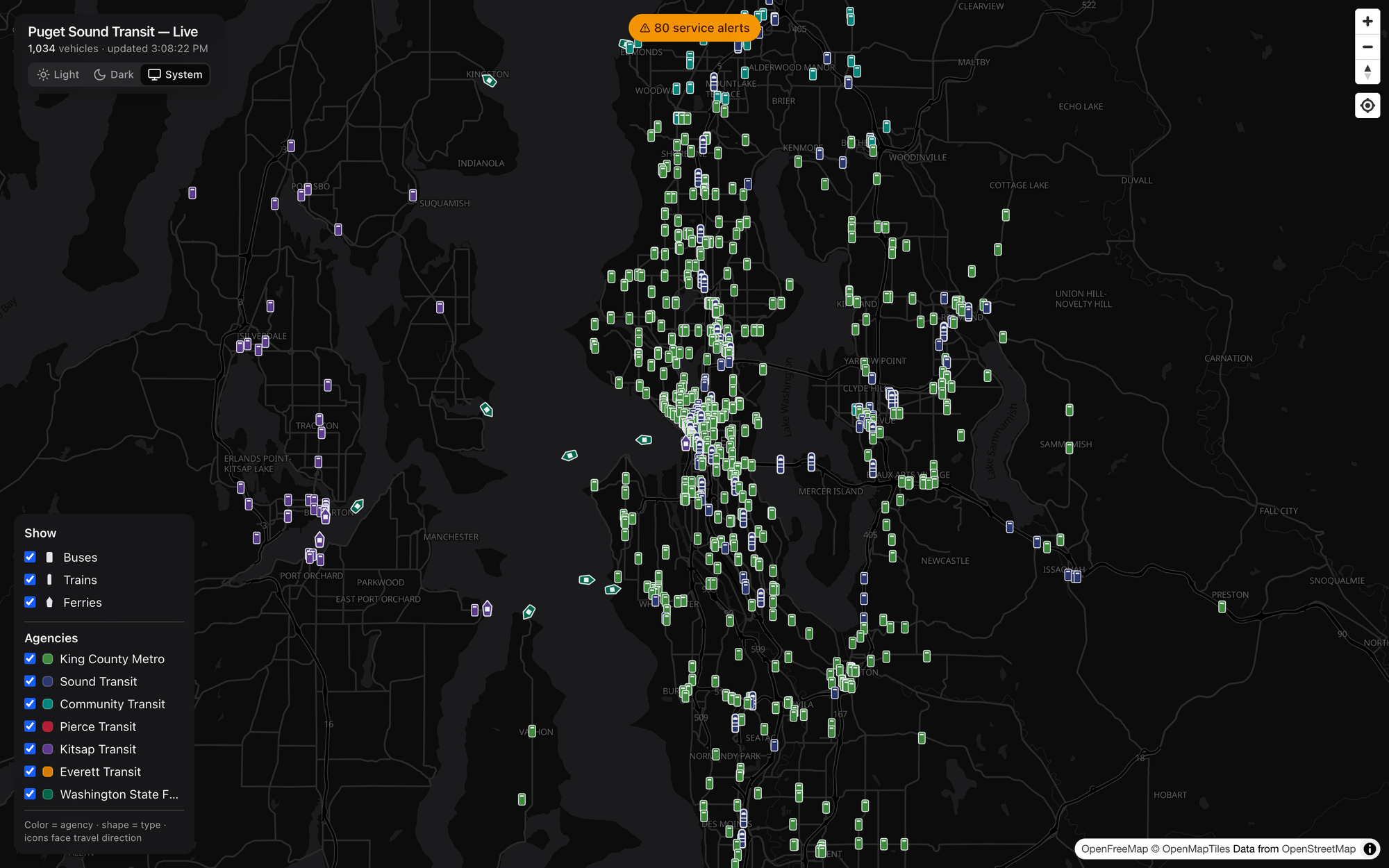
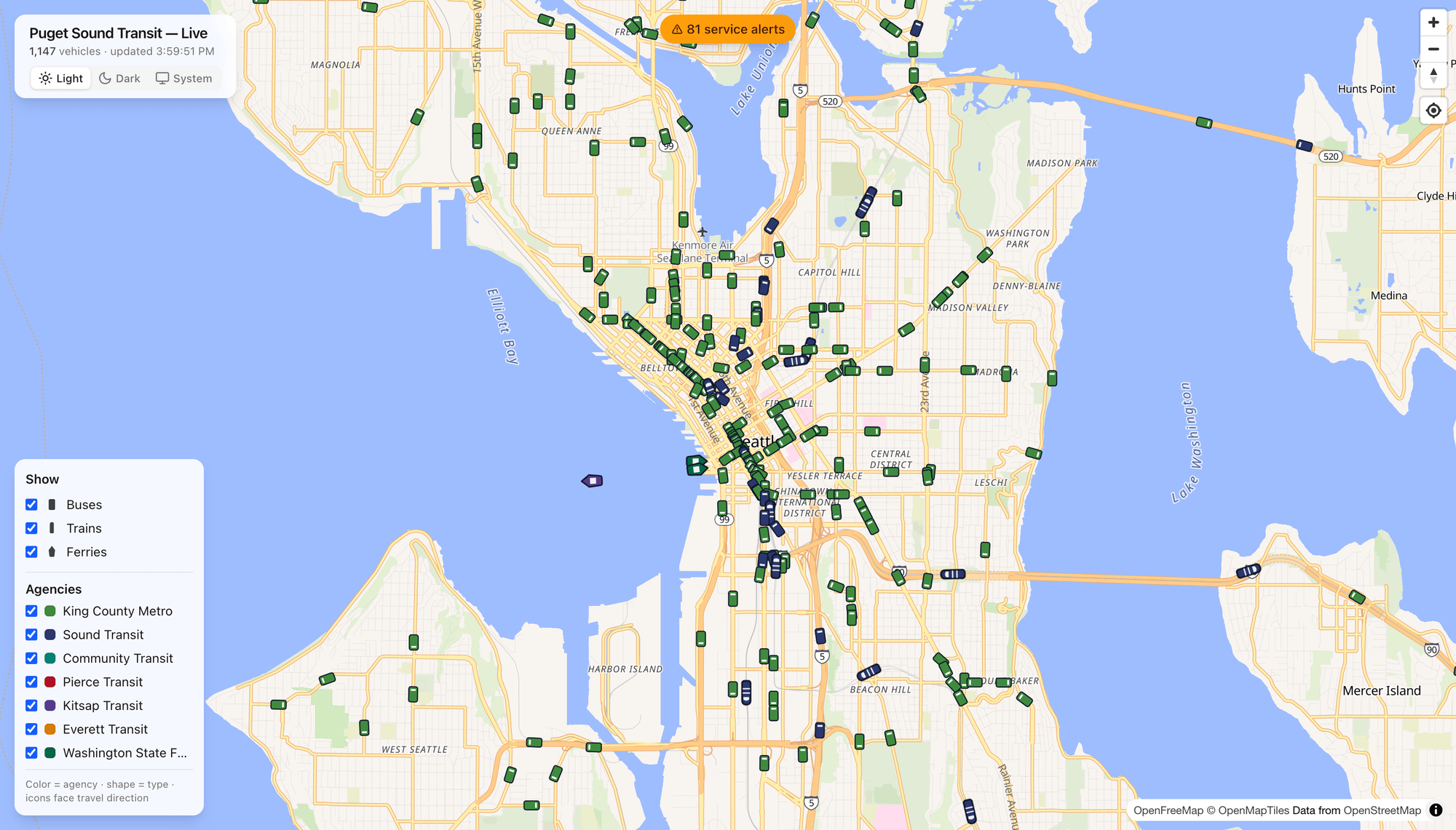
An overview of the city in transit.

The default view drops you over Puget Sound with everything turned on. A quick legend does a lot of work here: color tells you the agency and shape tells you the type (bus, train, or ferry), and every icon is rotated to face the direction it’s actually traveling. Green is King County Metro, blue/indigo is Sound Transit, red is Pierce Transit, purple is Kitsap, and so on — seven agencies in all, plus the ferries.

Pan, zoom, and the icons resize smoothly so trains read a little larger than buses, which read a little larger than ferries. Between updates, vehicles don’t teleport — they animate from their last position to the next one, so the whole map has a calm, continuous, living quality instead of a jumpy refresh.

Click any vehicle for the details
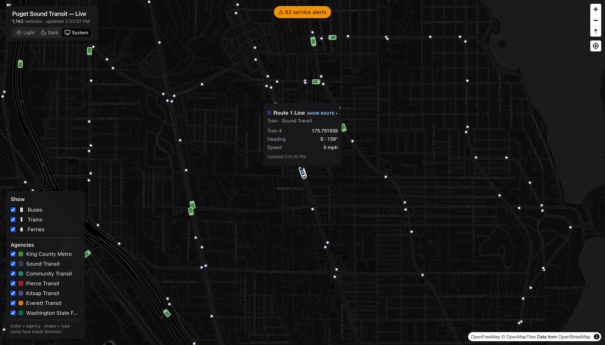
Showing Route 1 Line

Tap a vehicle and it tells you who it is: the route, the agency, the fleet number, its heading (as a compass direction and degrees), its speed, and when it last reported in. Here’s a 1 Line Link train in the Rainier Valley, heading south at 159°.

See that Show route ▸ link at the top of the popup? That’s where it gets fun.

See the entire route

Click Show route and the map draws the vehicle’s full line — the shape it follows and every stop along the way — right under the live vehicles still moving on it.

Link light rail line 1 in the south city.

Here’s the 1 Line, Link light rail’s spine, threading from the north down through downtown, Beacon Hill, and the Rainier Valley. The blue train icons strung along the highlighted line are the actual trains in service on it right now.
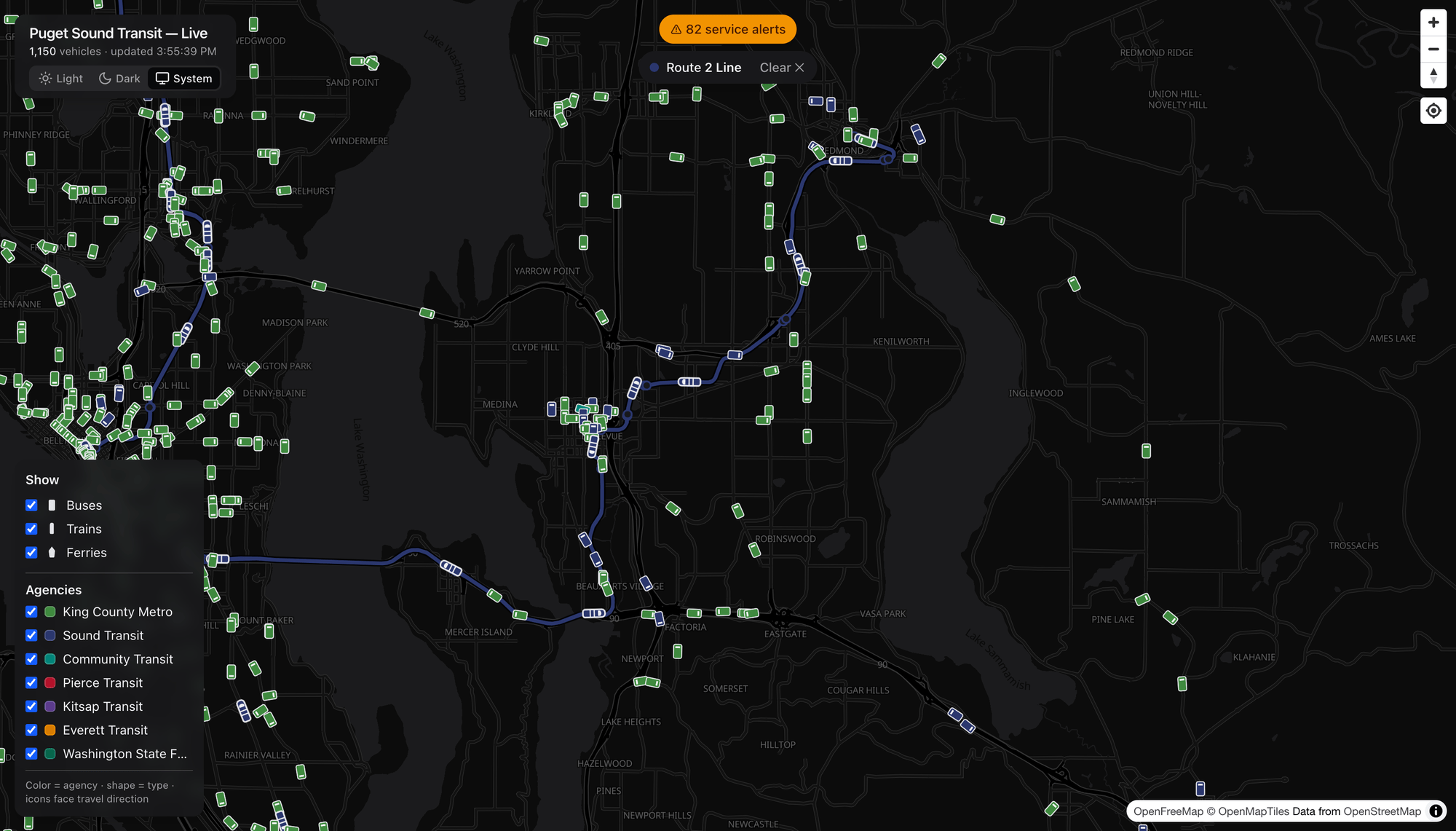
Link Light Rail 2 Line

And the newer 2 Line, running across Lake Washington on I‑90 to Bellevue and up to Downtown Redmond. (Fun bit of local history: the 2 Line effectively replaced the old ST Express 550 bus between Seattle and Bellevue — which is why you won’t find a 550 on the map anymore.)

Rail beyond Link: the Sounder

Light rail isn’t the only train out there. Pick a Sounder commuter-rail train and you get the full BNSF corridor.

South Sounder Commuter Rail Line.

This is the S Line, running from King Street Station in Seattle south through Tukwila, Kent, Auburn, and on toward Tacoma and Lakewood. Sounder only runs during peak commute windows, so catching one on the map is a small, satisfying reward for looking at the right time — and down in Tacoma you can see Pierce Transit’s red buses fill in the local network.

Buses, of course — every route

The same trick works for any bus. Click one, hit Show route, and the corridor lights up in that agency’s color.
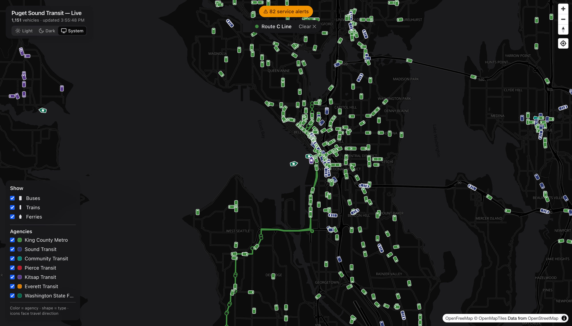
C Line Rapid Ride.

The RapidRide C Line from West Seattle into downtown, in Metro green.
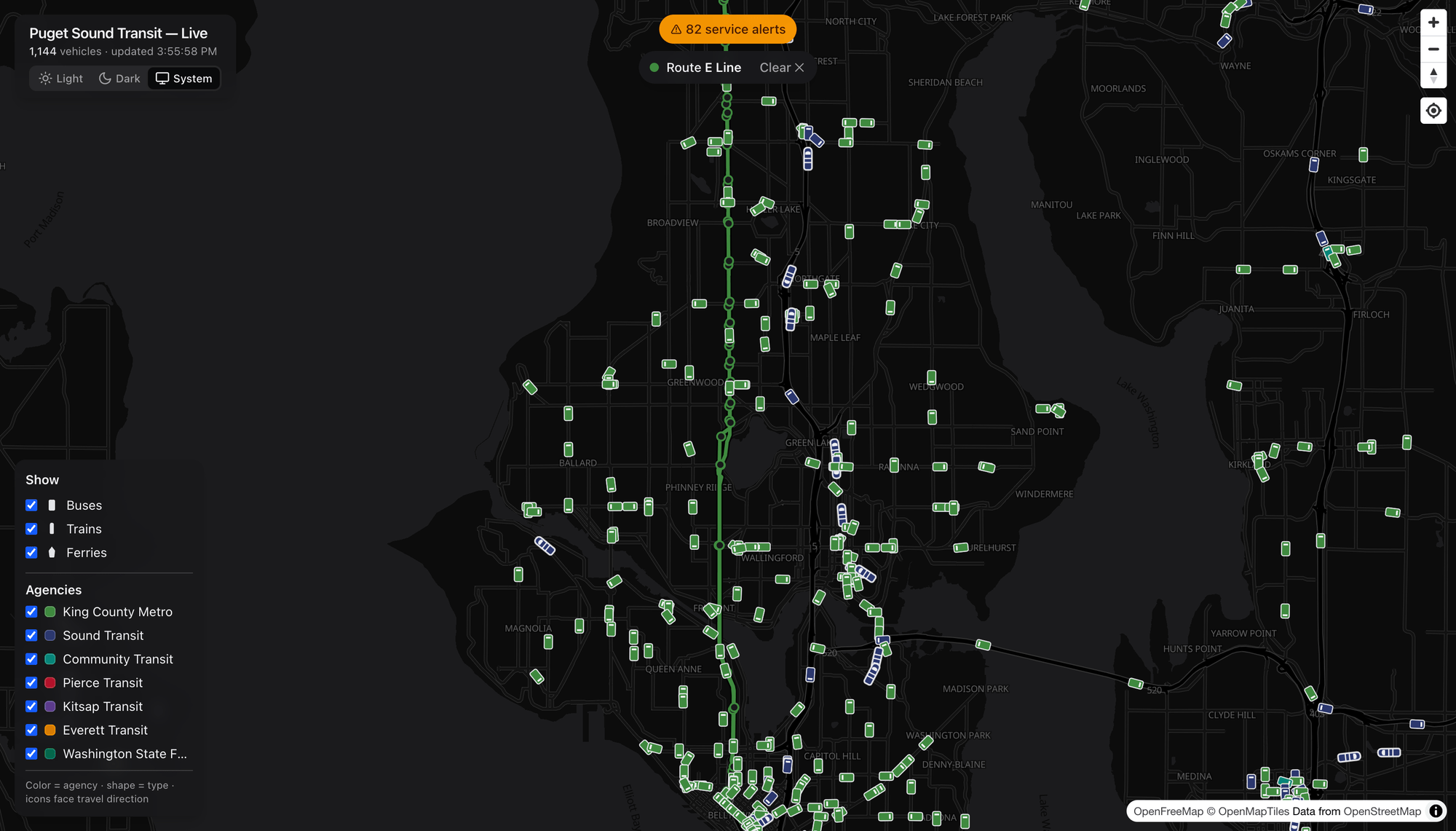
E Line Rapid Ride.

And the RapidRide E Line, a ruler-straight shot down Aurora Avenue from Shoreline to downtown — one of the busiest bus corridors in the state. Whether it’s a lettered RapidRide line, a numbered local route, or a Community Transit Swift line, the route overlay works the same way.

Filter the firehose

Eleven-hundred vehicles is a lot. The Show and Agencies panel lets you dial it in — toggle whole modes or individual agencies on and off.
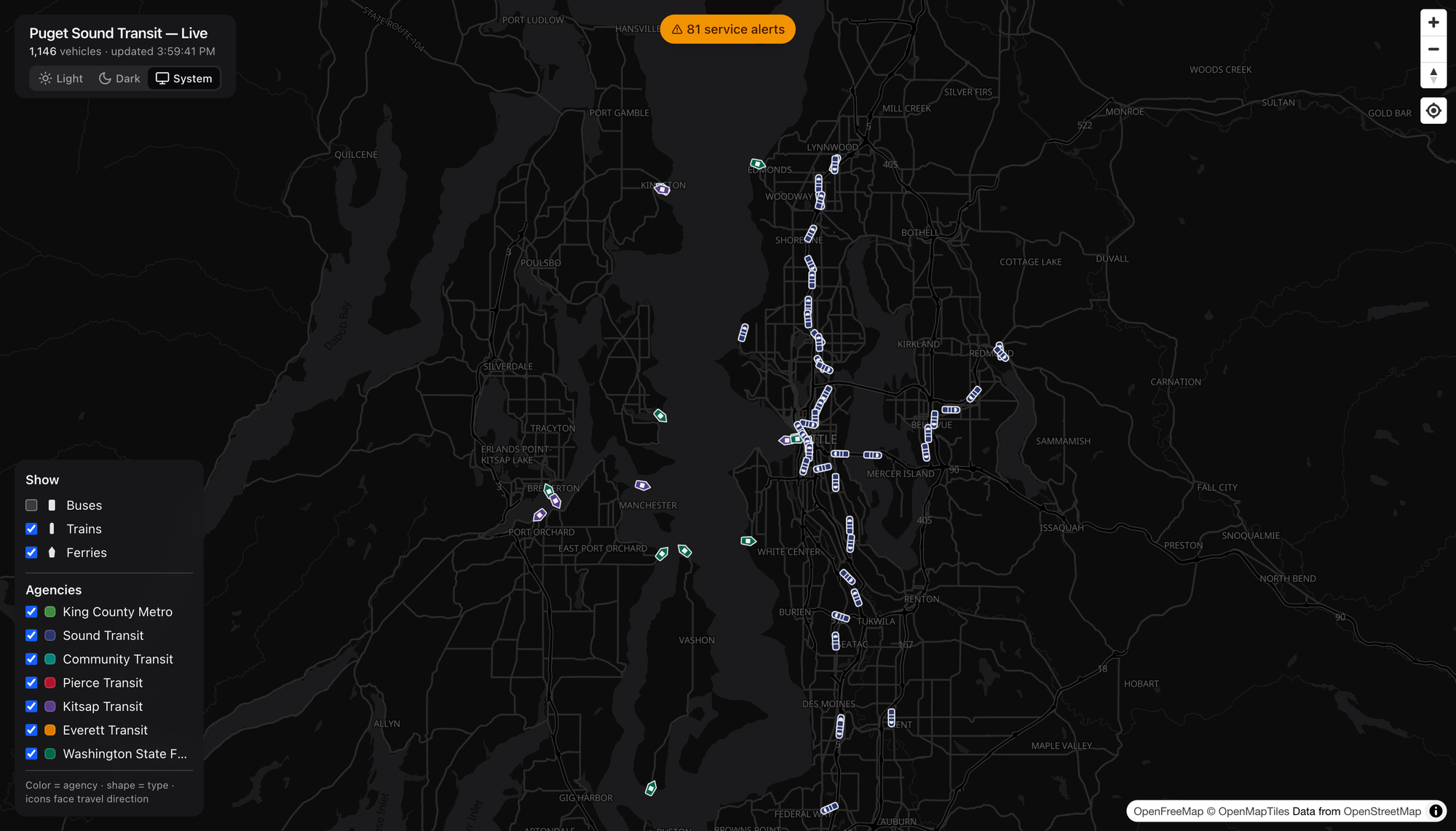
Filtering with busses off and only showing the trains and ferries.

Here I’ve switched off buses to leave just trains and ferries. Suddenly the shape of the rail network jumps out — the Link lines tracing north–south and across the lake — alongside the ferries stitching the Sound together to Bainbridge, Bremerton, Kingston, and Vashon. It’s the whole regional rail-and-water map, drawn entirely by the vehicles themselves.

When’s my ride? Live arrivals at any stop

Zoom in and the stops appear. Click one to get a live arrivals board.
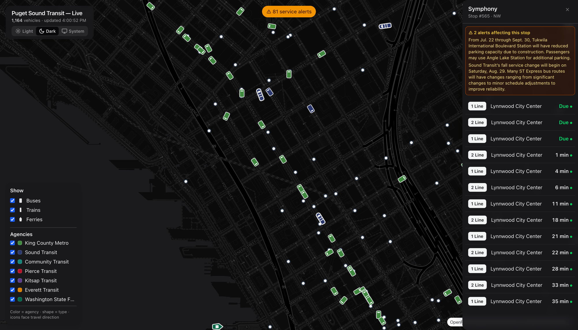
Stop arrivals.

This is the Symphony stop downtown, with real-time predictions counting down — Due, Due, 1 min, 4 min, 6 min… — for 1 Line and 2 Line trains toward Lynnwood City Center. Each prediction carries a live indicator, and any alerts that affect this specific stop are pinned right at the top.

Know before you go: service alerts
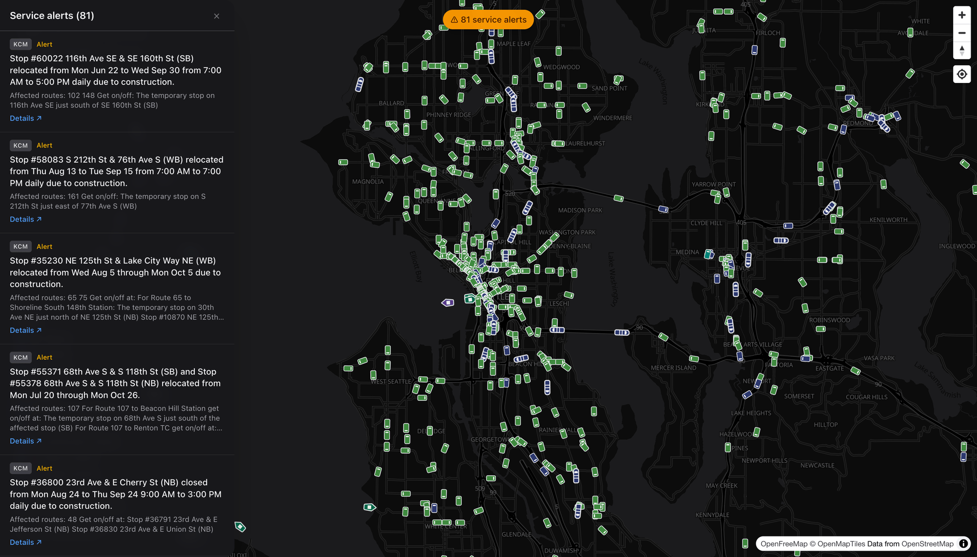
Service alerts!

The pill at the top of the screen keeps a running count of active service alerts across the region — detours, stop relocations, reduced service, construction. Open it and you can read them all: each card shows the agency, the affected routes, the reroute instructions, and a link out to the agency’s own detail page. It’s the regional “what’s disrupted right now” board in one place.

Light or dark, your call
Prefer a bright map? A theme toggle switches between a sleek dark basemap and a clean light one (with a System option that follows your OS). Same live data, different mood.

Under the hood

For the curious, Dashing Arrivals is a modern, open-source web app:

  • Live data comes from the OneBusAway Puget Sound regional API, decoded from GTFS‑realtime vehicle-position feeds. A single regional feed covers King County Metro, Sound Transit, Community Transit, Pierce Transit, Kitsap Transit, and Everett Transit.
  • Ferries come from a separate source — the WSDOT Washington State Ferries vessel-location API — and are normalized in alongside everything else.
  • The map is MapLibre GL on an open OpenFreeMap basemap (no proprietary map key required), with the app built on Next.js and React and deployed on Vercel.
  • Vehicle positions are fetched on a short polling loop and cached server-side, then eased between updates on the client so motion looks smooth. Icons are tinted per agency, sized by zoom, and rotated to the reported heading.

Eventually the GTFS feed is going to have some changes, and I plan to put those fixes in then, but in the meantime this is a solid way to explore the Seattle and Puget Sound area’s transit options!

Go watch the city move

That’s the whole pitch: one map, every vehicle, in real time, with routes, stops, arrivals, and alerts a click away. It’s genuinely useful for catching a bus — and, if you’re the type who likes watching systems work, it’s a little bit hypnotic.

Try it for yourself at dashingarrivals.com.


Screenshots captured live from dashingarrivals.com. Basemap © OpenFreeMap / OpenMapTiles, data © OpenStreetMap contributors. Real-time transit data via OneBusAway and WSDOT.


“Loop Engineering” Is Mostly Just Broken SDLC Wearing a Costume

I’ve been watching the “Loop Engineering” conversation build up steam for a while now and I keep landing in the same spot: I’m not buying it. Not the way it’s being sold, anyway.

The pitch is seductive. Wrap the LLM in a loop — plan, act, observe, correct, repeat — and you get an autonomous-ish thing that grinds away at your problem until it’s done. Everybody nods. It sounds rigorous. It sounds like engineering. And that’s exactly the part that’s bugging me, because the more of these “loop” architectures I look at, the more they look like something I’ve seen before. They look like the same slow, cumbersome, ceremony-laden SDLC that companies have been stuck in for thirty years — except now we’ve bolted it onto a language model and called it innovation.

Let me be blunt about the thing I actually think is happening here. We are not designing new ways to work with LLMs. We are retrofitting the broken software development lifecycle we already had onto a brand new kind of tool, and then acting surprised when the result is convoluted and bloated. The loop isn’t a breakthrough. In a lot of shops it’s a reskin of the ticket-grooming, status-meeting, hand-off-and-wait machine that made software slow in the first place. Largely, it defeats the entire advantage of using an LLM in the first place.

The tell: it’s ceremony, not capability

Here’s what tips me off. Go look at a bunch of these “agentic loop” designs in some of the more advanced companies – the ones that are supposedly doing this right – and count the steps. Plan the plan. Break the plan into subtasks. Score the subtasks. Route the subtasks. Re-plan when a subtask fails. Reflect on the reflection. Summarize the reflection into a memory. Retrieve the memory to plan the next plan.

Squint! That’s not a novel machine intelligence workflow. That’s Scrum with a transformer in the standup. It’s the same “process as a substitute for thinking” instinct that gave us story points and RACI charts and forty-five minute refinement meetings. We took a slow, human, coordination-heavy process – one that mostly exists because humans forget things, go home at night, and don’t share memory – and we handed it, wholesale, to a system that doesn’t forget in the same way, doesn’t go home, and can share state instantly.

The loop, in a huge number of cases, is coordination overhead that the model doesn’t actually need. We’re paying for it in tokens, latency, and complexity, and calling the bill “engineering rigor.”

Loops exist to cover for things LLMs shouldn’t need covered

Programmer looks at the loop getting errors.
Programmer looks at the loop getting errors and the tears and pain of the absurdity of it is driven home! The horror, the nightmare!

A loop is fundamentally an error-correction and coordination structure. You loop when you can’t get it right in one pass and you have no better way to make forward progress than to try, check, and try again. That’s a completely reasonable thing to do sometimes. But notice why the classic SDLC is so loopy: it’s loopy because the humans and systems in it have terrible, lossy interfaces to each other. Requirements get garbled on the way to the dev. Context evaporates between the ticket and the code. Nobody can see the whole thing at once, so we iterate blindly and use process to catch the drops.

When you lift that structure and drop it onto an LLM, you inherit all of those assumptions – lossy hand-offs, missing context, blind iteration – even when they no longer apply. The model can hold enormous context. It can be given the whole picture at once. It can be handed clean, structured inputs instead of a garbled ticket. So a lot of the loop is there to solve a problem you’ve already got the tools to eliminate. You’re building a bucket brigade next to a working fire hose.

That’s the reframe I want people chewing on: don’t fit the LLM to the broken SDLC. Fix the SDLC around what the LLM is actually good at, and a lot of the loop – and the SDLC – just disappears. Not all of it — some feedback is real and necessary — but a lot of it goes away.

So what do you build instead? Workflows, not loops.

A workflow is a directed thing. It has a shape. It moves from a known input to a known output through steps that each do one clear job, and it only bends back on itself where a real signal says it must. Not on a fixed “reflect every turn” cadence because the architecture diagram had a box for it. Here are the approaches I’d actually reach for, and roughly in the order I’d reach for them.

1. Front-load context so the first pass is the good pass

The single biggest source of looping is a bad first attempt caused by starved input – a barren prompt that is missing context, scope, and specifics. So stop starving it. Instead of a thin prompt and a correction loop to claw the quality back, spend your engineering effort upfront assembling everything the model needs: the relevant code, the schemas, the conventions, the prior decisions, the actual constraints. Curate it. Structure it. Hand the model the whole board. Give it a specific thing to do with plenty of reference (MCP/RAG, etc) to get what it needs to get the job done right from inception.

This is a workflow move, not a loop move. You’re not iterating toward context — you’re delivering it before step one. The payoff is enormous, because every loop you avoid is latency and tokens and a chance to go off the rails that you never spent. A well-fed single pass beats a starved five-pass loop most of the time, and it’s cheaper and easier to reason about. Put the work where it compounds: the input.

2. Decompose along data flow, not along a status board

When a task genuinely is too big for one pass, the instinct from SDLC-brain is to break it into “tickets” and manage them in a loop. Don’t. Break it along the data instead – a pipeline where each stage has a typed input and a typed output, and stages connect because one’s output is literally the next one’s input.

Extract, then transform, then validate, then render. Parse, then plan, then generate, then check. Each stage is a small, boring, testable unit that does one thing to a known input. This is the old Unix-pipe wisdom, and it holds up beautifully with LLMs: small components with sharp interfaces that you can compose, test, and swap. The magic is that a clean pipeline removes the reason to loop – you’re not re-planning the whole job when stage three hiccups, you’re re-running stage three. The blast radius of a failure is one stage, not the entire task. That’s the difference between a workflow and a loop: the workflow contains failure; the loop lets it slosh around the whole system.

3. Make feedback event-driven, not clock-driven

Here’s where I think the loop crowd goes most wrong. In a canonical loop, you reflect and re-plan every iteration, on a cadence, whether or not anything happened worth reflecting on. That’s the transformer equivalent of a daily standup where nothing changed but everyone talks anyway. Pure ceremony.

Flip it. Don’t loop on a clock – react to events. Wire the model into a workflow where a specific, real signal triggers a specific corrective action. Tests failed? Route the failing output and the error back for a targeted fix – not a full re-plan, just “fix this.” Schema validation rejected the payload? Send it back with the exact violation. A confidence or a guard check tripped? Escalate that one thing. Everything else flows straight through.

The behavior looks loop-like from a distance, sure – things sometimes go back around. But the structure is completely different, and the difference is the whole point. Correction happens because something concrete demanded it, scoped to exactly what broke, instead of on a blind fixed schedule that burns tokens re-litigating work that was already fine. Nine times out of ten nothing needs to go back, and your workflow should sail straight through when that’s the case.

4. Push determinism to the edges and let the model do the fuzzy middle

A ton of what gets stuffed inside these loops is stuff the model has no business doing repeatedly – running code, hitting an API, checking a value against a rule, formatting an output. Every time you make the LLM babysit that inside a reasoning loop, you’ve added a slow, nondeterministic, expensive step to do a job that a plain function does perfectly, instantly, and the same way every time.

So carve it out. Let deterministic code own everything that can be deterministic: the tool calls, the validation, the I/O, the formatting, the branching on hard rules. Let the model own the genuinely fuzzy judgment in the middle – the part that actually needs a language model. When you draw that line cleanly, the “loop” collapses into a mostly-straight workflow with the LLM as one well-scoped component inside a larger deterministic system, instead of the LLM being the anxious general contractor re-checking every subcontractor’s work on every pass. Less looping, more determinism, and the model spends its cycles on the one thing only it can do.

Pulling it together

Put those four together and look at the shape you get. You front-load context so the first pass lands. You decompose along data flow so failures stay contained. You make correction event-driven so you only bend back when something real demands it. And you push everything deterministic out to the edges so the model isn’t looping over work a function should own. What’s left is a workflow – directed, inspectable, cheap, testable – with the LLM doing the fuzzy judgment it’s uniquely good at and nothing else.

Compare that to the canonical loop: an undirected grind, re-planning and re-reflecting on a cadence, coordination overhead standing in for capability, the whole thing shaped by the assumption that every hand-off is lossy and every input is garbled – assumptions that came straight out of the broken SDLC and mostly don’t apply here.

I want to be fair about it: loops aren’t always wrong. There are open-ended, genuinely exploratory problems where you can’t shape the path in advance and try-check-try is honestly the best you’ve got. Fine. But that’s the exception, and right now the industry is treating it as the default. We’re reaching for the loop reflexively because it feels like the rigorous, grown-up, “real engineering” thing to do – when a lot of the time it’s just the old ceremony in new clothes.

There’s more going on with LLMs than the loop. A lot more. The loop is one tool, and it’s become a bit of a security blanket for people who’d rather port their existing broken process than sit down and design a new one. My request is simple: before you wrap your model in yet another plan-act-reflect grinder, ask what the loop is actually for in your case. If the honest answer is “to cover for lossy hand-offs and missing context,” then you don’t have a loop problem. You have an SDLC you never cleaned up – and the fix is a workflow, not another lap.

Adding Time Range Generation to Data Diluvium

Following up on my previous posts about adding humidity and temperature data generation to Data Diluvium, I’m now adding a Time Range generator. I decided this would be a nice addition to give any graphing of the data a good look. This will complete the trio of generators I needed for my TimeScale DB setup. While humidity and temperature provide the environmental data, the Time Range generator ensures we have properly spaced time points for our time-series analysis.

Why Time Range Generation?

When working with TimeScale DB for time-series data, having evenly spaced time points is crucial for accurate analysis. I’ve found that many of my experiments require data points that are:

  • Evenly distributed across a time window
  • Properly spaced for consistent analysis
  • Flexible enough to handle different sampling rates
  • Random in their starting point to avoid bias

The Implementation

I created a Time Range generator that produces timestamps based on a 2-hour window. Here’s what I considered:

  • Default 2-hour time window
  • Even distribution of points across the window
  • Random starting point within a reasonable range
  • Support for various numbers of data points

Here’s how I implemented this in Data Diluvium:

Continue reading “Adding Time Range Generation to Data Diluvium” →

MongoDB Atlas SDK: A Modern Toolkit

Lately, I’ve been diving into the MongoDB Atlas SDK, and it’s clear that this tool isn’t just about simplifying interactions with Atlas it’s about reimagining the developer experience across multiple languages. Whether you’re a JavaScript junkie or a polyglot juggling Go, Java, and C#, the Atlas SDK aims to be an intuitive, powerful addition to your toolkit.

In this post, I’ll break down some of the core features of the Atlas SDK, share some hands-on experiences, and extend my exploration with examples in Go, Java, and C#. If you’ve ever wished that managing your clusters and configurations could be more straightforward and less “boilerplate heavy,” keep reading.

A Quick Recap: What the Atlas SDK Brings to the Table

At its heart, the MongoDB Atlas SDK abstracts the underlying Atlas API, making it easier to work with managed clusters, deployments, and security configurations. Here are a few standout features:

  • Intuitive API: The SDK feels natural, following patterns that resonate with MongoDB’s broader ecosystem. It’s almost always nice to just call into a set of SDK libraries vs. writing up an entire layer to call and manage the calls to an API tier itself.
  • Robust Functionality: It covers everything from cluster management to advanced security settings.
  • Modern Practices: Asynchronous and promise-based (or equivalent in your language of choice), the SDK fits snugly into today’s development paradigms.
  • Streamlined Setup: Detailed documentation and easy configuration mean you can spend more time coding and less time wrestling with setup.
Continue reading “MongoDB Atlas SDK: A Modern Toolkit” →

A Successful Deploy to Vercel + Adding More Auth & Login Features to The Web Interface (Plus an Error!)

In the last few posts I knocked out a slew of initial work. Much of it was just to get things up and running and make sure the database was live, the site was live, and that there was a good connection between the two. I did this by building the first basic login page with a dashboard that just shows that the user is logged in, along with a few pages to display general static content. That can be found in:

  1. Building “Adron’s Core Platform”: Starting a React App on Vercel
  2. Getting a Vercel PostgreSQL Database and Basic Authentication Operational
  3. The Confederacy of Errors Starting With Next Auth; Error, Error, npm ERR!

The tasks I’ll accomplish in the following post:

  1. I want a horizontal menu across the top that will link to the dashboard, login, and about page.
  2. I want an account creation page.
  3. I want to make sure that I set things up for the post-login action to be a redirect to the dashboard page.

Adding a Horizontal Menu

For this menu I’m going to add a div with links, assign it as a flex space (css), and add the pertinent links. The changed ./src/app/components/Navigation.tsx with changes looks like this now.

Continue reading “A Successful Deploy to Vercel + Adding More Auth & Login Features to The Web Interface (Plus an Error!)” →